From the surrealist world of Magritte to centuries-old churches and gardens, I’ve given you a peek into the art and architecture of Brussels’ past. Now it’s time to step into the 21st Century and see what the Belgian modern and contemporary art scenes have to offer (and it’s a lot!). Both of the museums featured in this post have commenced their operations in the past five years and the feeling of excitement and discovery is palpable at both institutions. Sometimes when you visit long-established art museums, the dust has collected atop the permanent collection and you feel like the curators are simply going through the motions, ushering in another round of tourists and amassing their coin. Not only are the directors at MIMA and KANAL new on the scene, but they’re also trying to shake things up a bit with their offerings. You can sense the fire in their bellies to say something new.
MIMA (Millennium Iconoclast Museum of Art)

MIMA opened its doors in 2016 at the old Bellevue Factory. The former brewery is located alongside a series of canals in the rough-and-tumble industrial district of Molenbeek, a perfect match for this contemporary art collection. The founders of MIMA want to focus on what they describe as “Culture 2.0,” which includes activities like skateboarding, punk rock, graffiti and other hallmarks of counter-culture. The exhibitions also heavily feature modern technology, in part as a means to make the art more accessible to younger generations. The curators consciously introduced a gamification aspect to contemporary art, must like the language-learning app Duolingo applies gamification to mastering a foreign language. One can be eased into the subject matter and enticed with point systems and competition before realizing that you actually are participating in genuine learning. Sometimes contemporary and modern art can feel intimidating, but MIMA presents it in a deceiving simple way before allowing the critical thinking to kick in.
MIMA rotates its special exhibitions in one fell swoop, with each iteration of the museum hanging together on a single theme. I visited during “Dream Box,” which explored the intersections of technology and the imagination with social issues and cultural change. It was broken up into five section: psychedelic illusion, visual trance, musical incantation, anamorphosis (the process of a fractured image coming into focus when viewed with the correct mirror or lens) and simulation of reality.
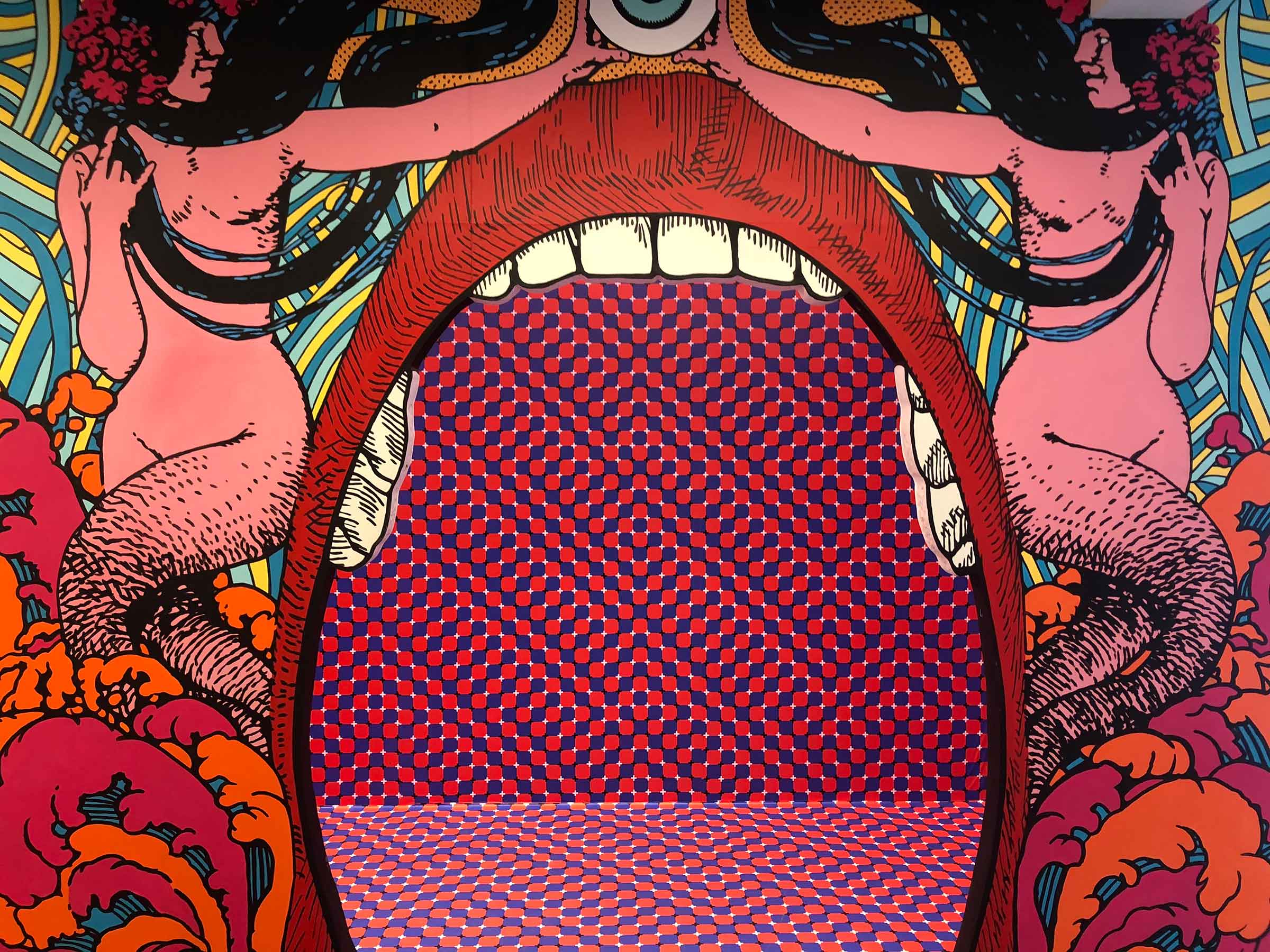
Up first, and most difficult to capture in photographs, was Elzo Durt’s Psyche Palace, a veritable acid-trip of a funhouse with bright colors, flashing lights and a dazzling hall of mirrors. Durt is most famous for his work in the Belgian punk rock scene, but he has also expanded his interests into creating contemporary art. Psyche Palace lets you know right off the bat that this is art you’re going to experience and fully-interact with- not simply stand and stare at. Part of the gamification of the museum means that you will be an active participant in the exhibits.
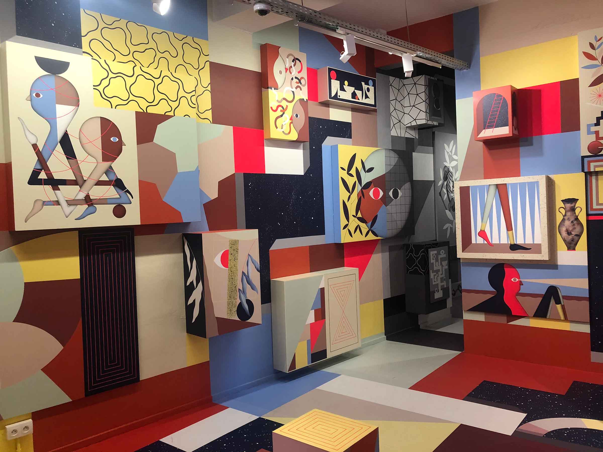
The Hell’O Collective is comprised of two Belgian artists, Jérôme Meynen and Antoine Detaille, who began their artistic endeavors as street artists in the vein of Bansky, before transitioning into studio work. Their art features elements from Belgian folklore and fairy tales, whose figures are placed in surrealist environments composed of strong geometric shapes and the dualities of light and dark. They describe their work as “highly structured chaos,” and there’s definitely a lot to take in!
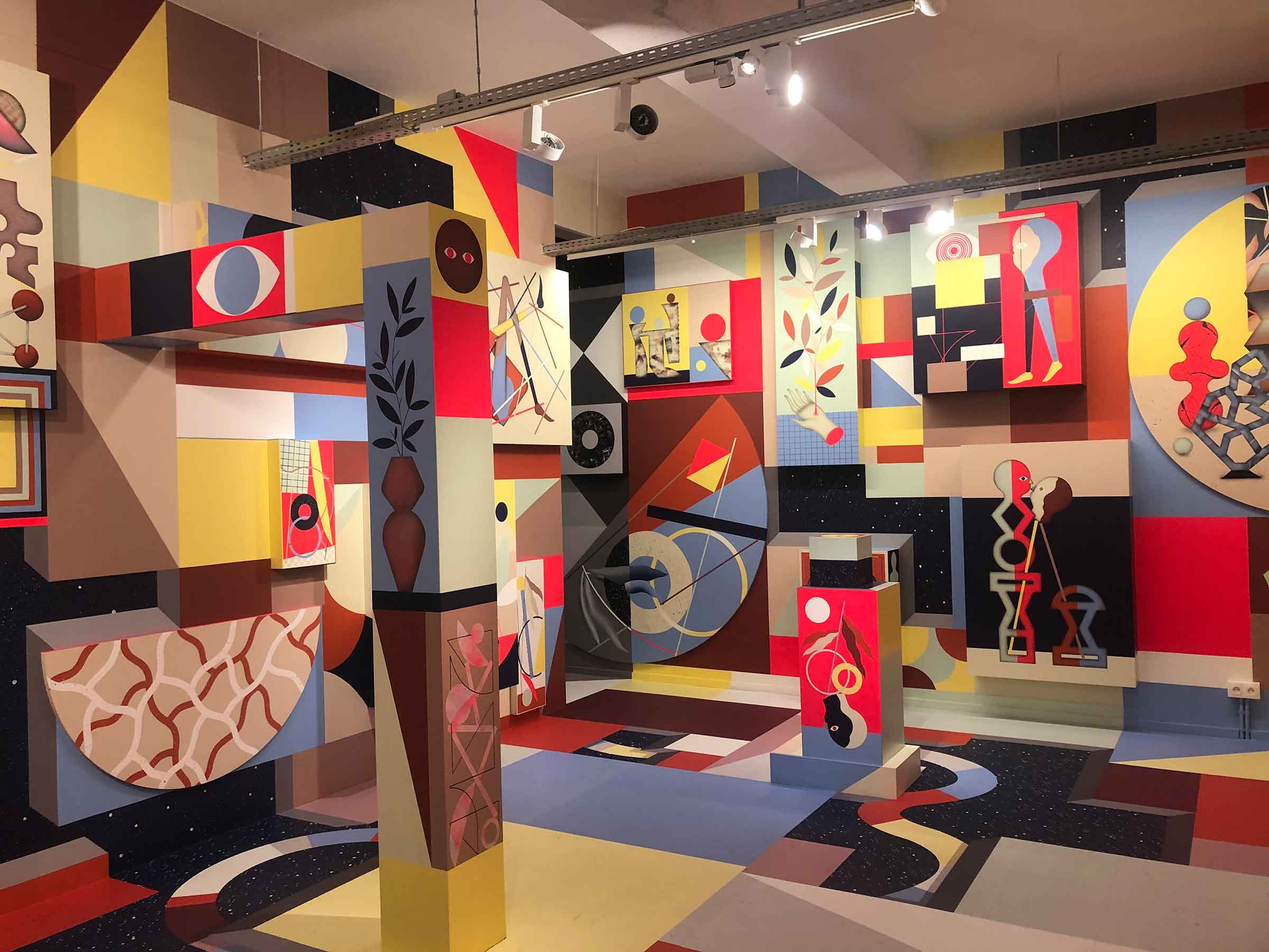
Their exhibition Innerspace at MIMA is a mirror world, with half of the space covered in primary colors, representing a bright and vivid dream. This is contrasted by a black and white nightmare with troubled figures expressing depressed emotions. The two halves of the room are not simply replicas of one another (with one in color and the other in black and white), but rather they are distorted realities that give you a sense of déjà vu as you explore the two worlds.
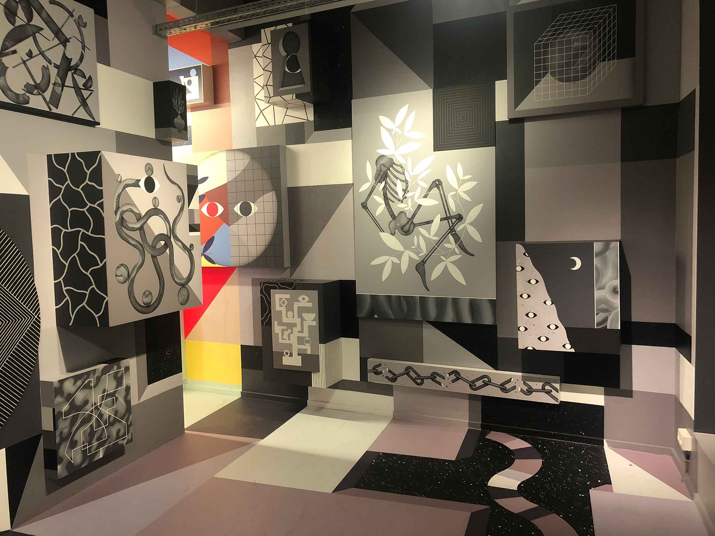
In the technicolor space, flora springs forth from clay pots and the flesh of the palm on someone’s hand. Humanity is a life force on this side of the room. In the black and white world, the overgrowth (looking remarkably like butterflies) has entwined itself with the bones of a human skeleton. The geometric shapes that were once whole are now shattered on this side of the universe; chains lie broken and circles levitate, snapped in two.
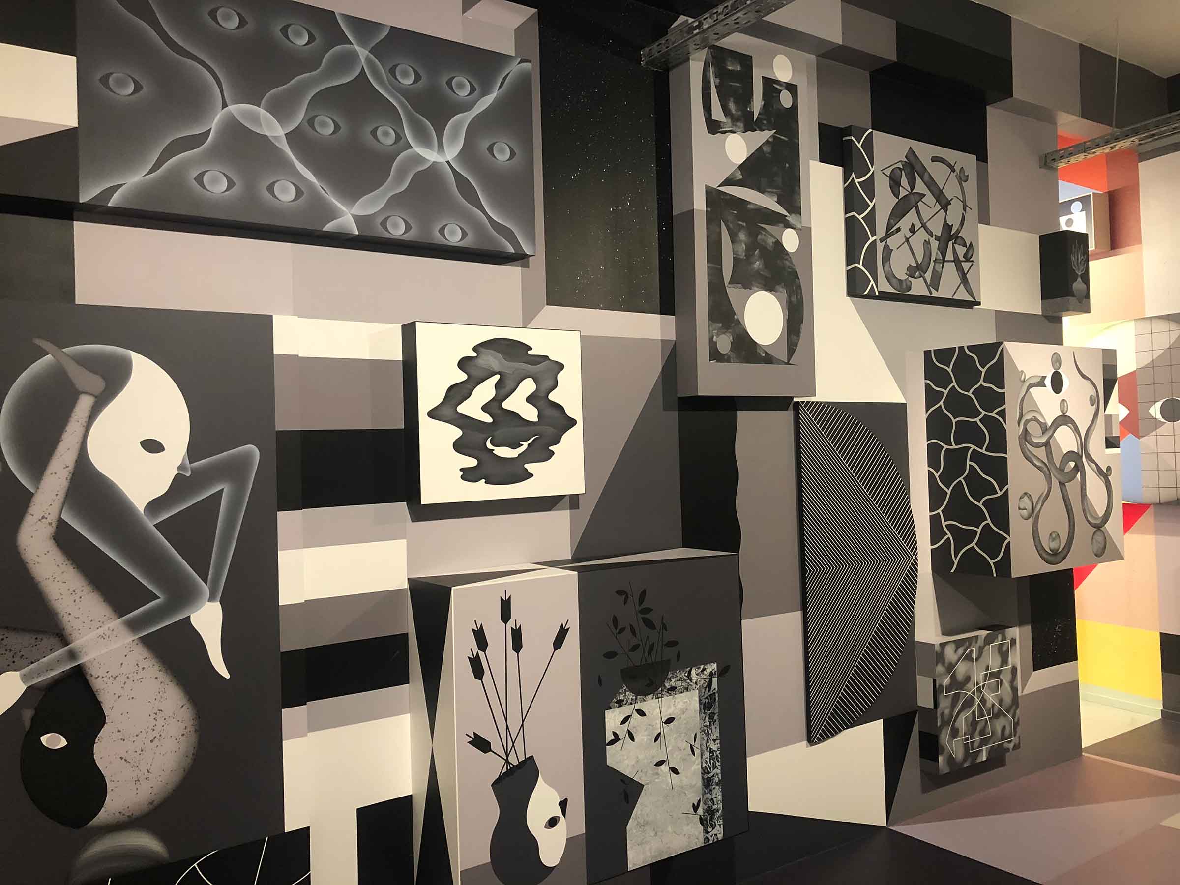
Walking back and forth between the two halves of the same room we are left questioning, “Am I living in a happy, colorful world and having a nightmare when I close my eyes, or am I existing in a hellscape, left dreaming of a better tomorrow throughout night?”
I had a blast tickling the digital ivories of the third exhibition, but this segment also carried the steepest learning curve. The Spanish artist Escif created a Magic Piano, an interactive wall of images of that play different snippets of music when an ipad-type device is moved over the various figures causing them to dance. The piano is tuned to “Coltan Major Harmonics” and deals with coltan mining in the Democratic Republic of the Congo (DRC). Coltan, a metallic ore that is a combination of niobium and tantalum, is chiefly extracted from Central Africa and used in nearly all electronics from cellphones to PCs and cameras.
In 2003, Bayer was linked to funding rebel groups in the DRC that culminated in a civil war that would last nearly twelve years. During this time, global companies were able to exploit workers in the mines and smuggle coltan out of the country through the unstable borders. Whenever the fighting would start to subside, it was discovered that over twenty international companies would fund the losing side to perpetuate the civil war. War crime trials are ongoing at The Hague for the executives of these companies, but lasting damage from the war has left parts the DRC in a volatile and fragile state. The (intended) irony of Escif’s work is that you have to use a device powered by coltan in order to view his condemnation of the workers’ strife.
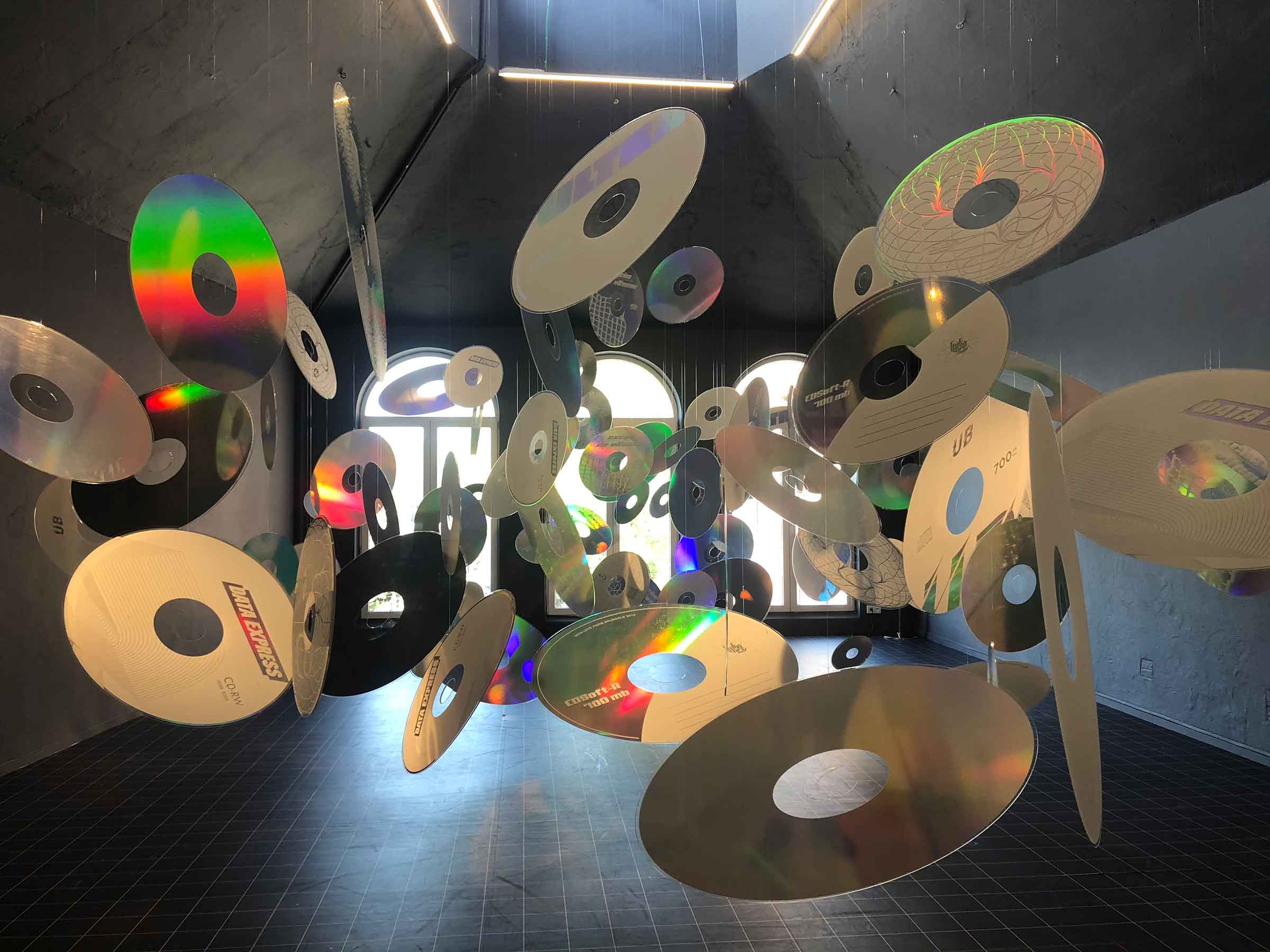
For his segment, Argentine artist Felipe Pantone created a hall of hanging CD-ROMs in one of the upper floors of the former brewery that was meant to drag us from our analog past towards a digitized future. As the CD-ROMs twirled on their strings, the light was refracted through a prism of a colors all over the room. Most of this was powered by natural light; as the sun passed behind a cloud, the space would become moody and dark until the cloud drifted by and the sunlight was able to enliven the room again.
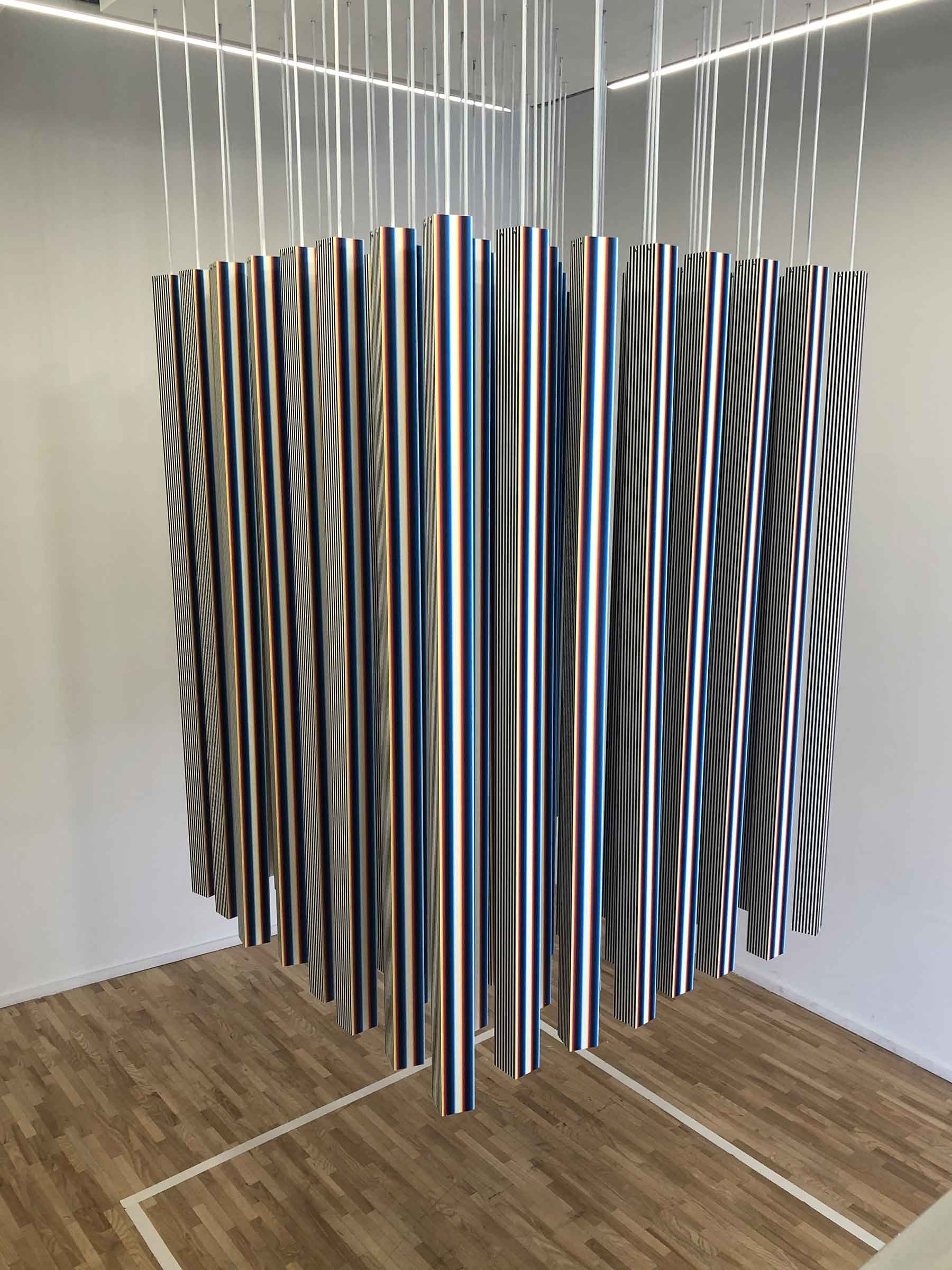
Patone creates kinetic art, which is art that is either perceived to being moving by the viewer or is actually in motion by some mechanical means. With Interference Pattern Programmed by Motion Sequence, Pantone hung 64 pipes that slowly rotated with the assistance of a computer program. The gentle hum of the spinning metal created a calming effect and visitors were encouraged to either sit on the floor and meditate or even practice some yoga. Once again, judging from a photo, it looks like Pantone just dangled a bunch of pipes from the ceiling, but when you experience it in person, the art comes alive because of the human interaction with it.
The final portion of Dream Box was called Self’Art, by a group known as Gogolplex. You walked into an office space styled with 80’s furniture and beige cubicles. You then were assessed through an online questionnaire that claimed it could create a piece of art that would “best suit you.” The whole thing was a riff on the banality of corporate culture and the questions were of the Myers-Briggs variety (I like to hear dogs barking A) all of the time, B) some of the time, C) never or D) only at night). After the IQ test, it generated your perfect piece of art, which for me was a pixelated apple(!) and then was shown the door. It was all hilariously stupid, but the satire was spot on; the cubicles walls reminded me of my father’s government office that I would visit on take-your-child-to-work day. I’m sure my dad put up with the same bureaucratic nonsense and received similar inane results from his superiors. Well done, Gogolplex!
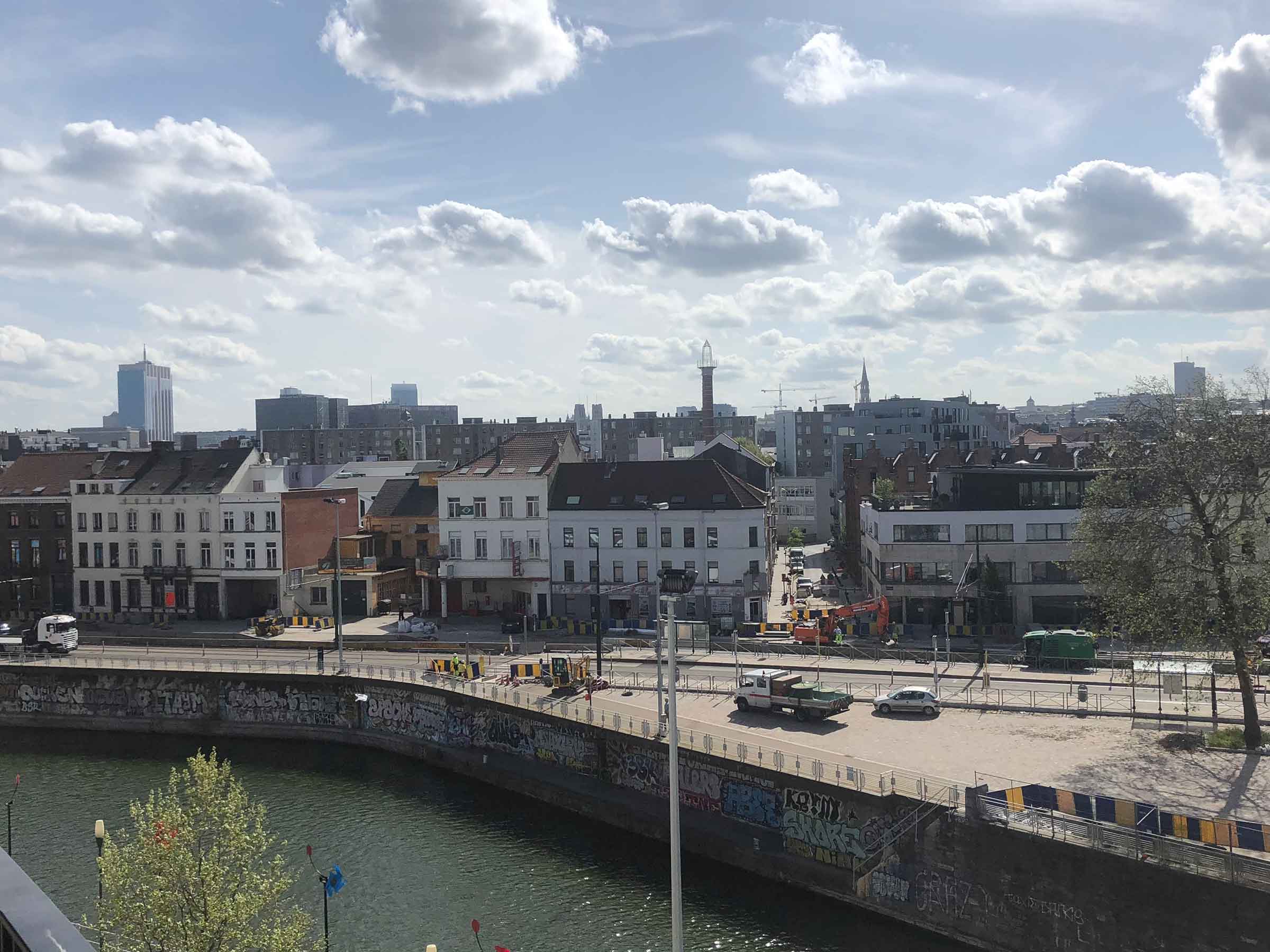
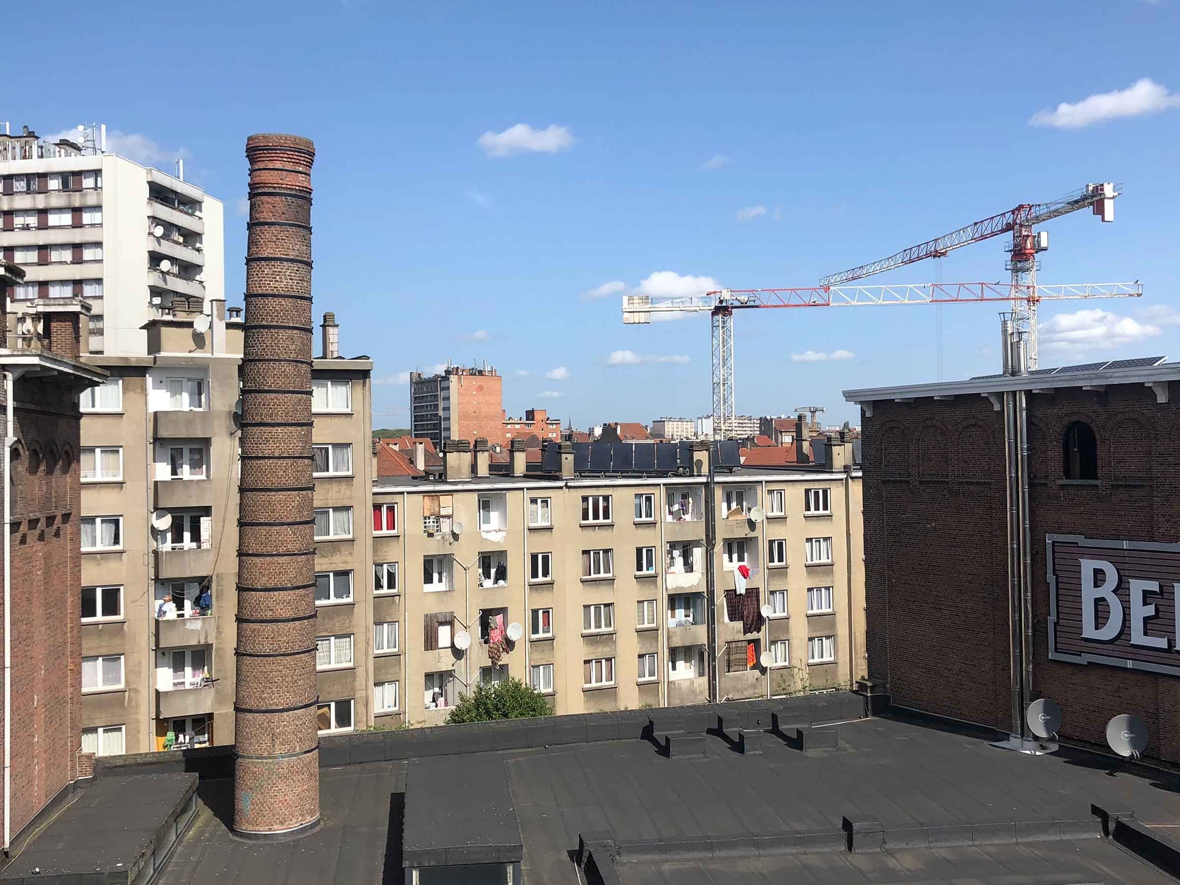
The top floor of MIMA houses a small collection of paintings, which I gathered they were trying to transform into their permanent collection. You’re free to climb up the ladder to the roof and check out the graffiti along the canals. The Grand Place may be surrounded by vendors peddling overpriced Belgian waffles, but here in Molenbeek you’ll find real bakeries frequented by locals on their morning commutes. Prices are low and pastries are buttery and delectable. After you’ve spent some time at MIMA, indulge in a well-deserved snack.
Brussels Street Art
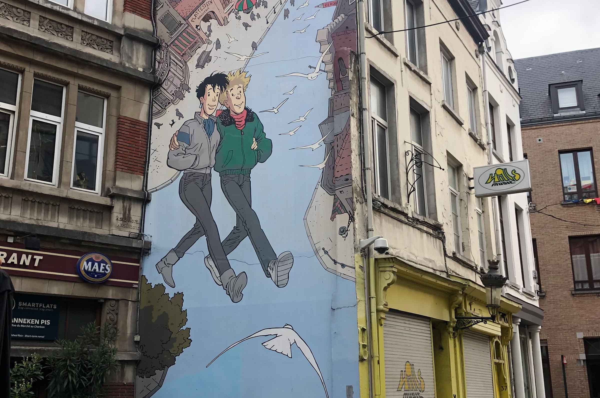
When sitting around a hostel common room, one word pops up over and over again when discussing things to do or see in a certain city: Free. What can I do for free around here? Is there a free walking tour? What day of the month does the museum offer free admission? Young backpackers are often on a tight budget (or are saving their money for the pub crawl that evening) and don’t want to drop serious cash on tickets to palaces and art museums during the day. My anecdotal evidence also shows that street-art suggestions are usually a crowd pleaser, which makes the writing off of Brussels as a popular destination all the more bewildering.
The Belgian capital is teeming with murals, often inspired by European graphic novels, that are, of course, completely free to view. Brussels’ first large-scale piece of street art, Broussaille, was painted by Frank Pé in 1991 in the city’s gay district. Broussaille was a big hit with locals and visitors alike, prompting the city government in 1993 to begin commissioning other outdoor works to juice the capital’s tourism numbers. Today there’s even a free app, “Brussels Comic Strip Wall Tour,” that will direct you to 66 of Brussels’ most famous murals and give you some fun tidbits about the art along the way.
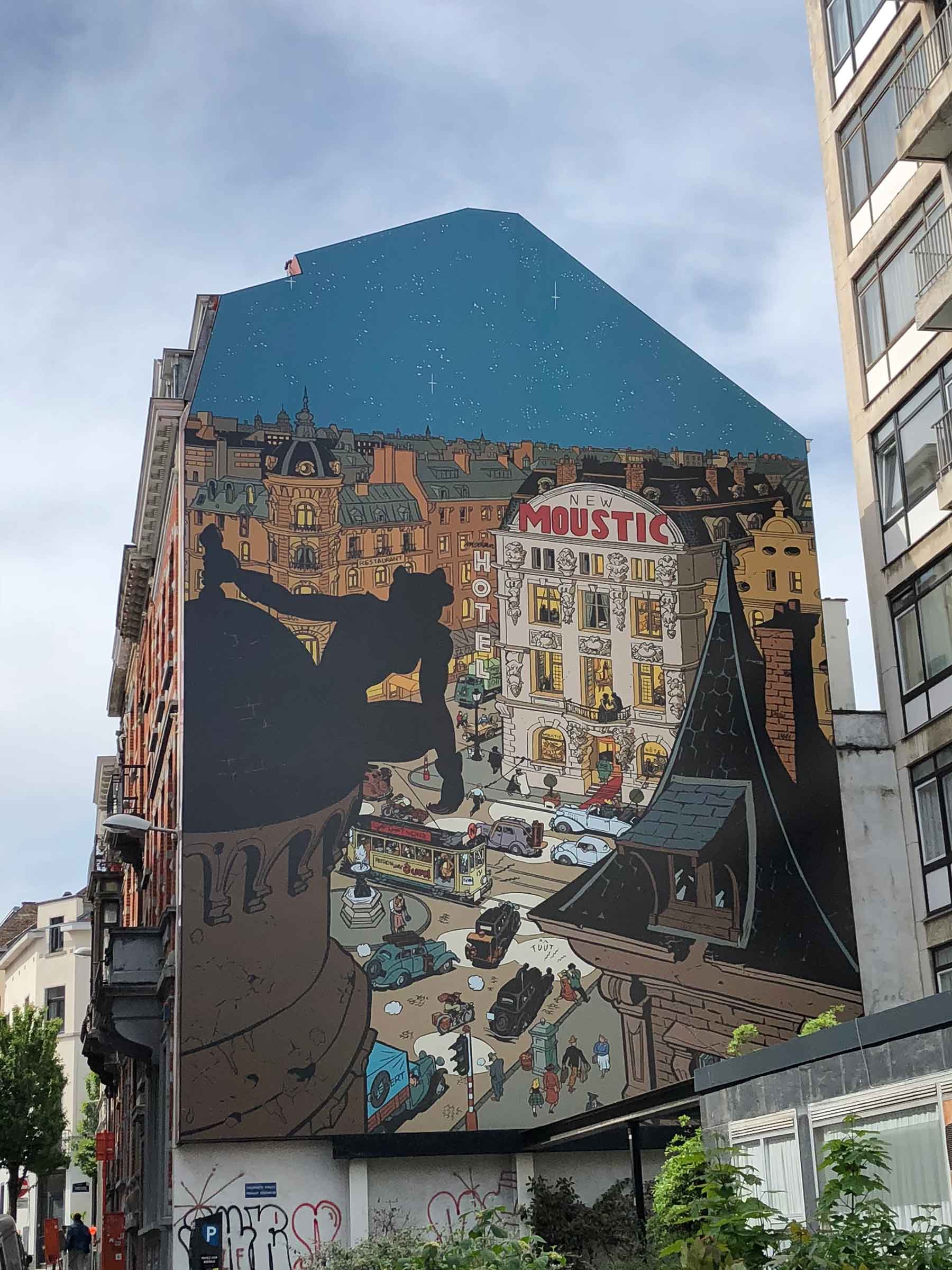
La femme leopard is one of the largest murals in Brussels and is taken from the pages of Spirou magazine, one of two rival comic publications in France and Belgium. Spirou was founded in 1938 as an eight-page collection of various comics, mostly from the French-speaking world, but occasionally from the United States as well. The popular strips were collected and released in volumes after their runs concluded. Just like we have Marvel and DC Comics here in the states, Spirou began a rivalry with Tintin comics in the 1940s that still exists today.
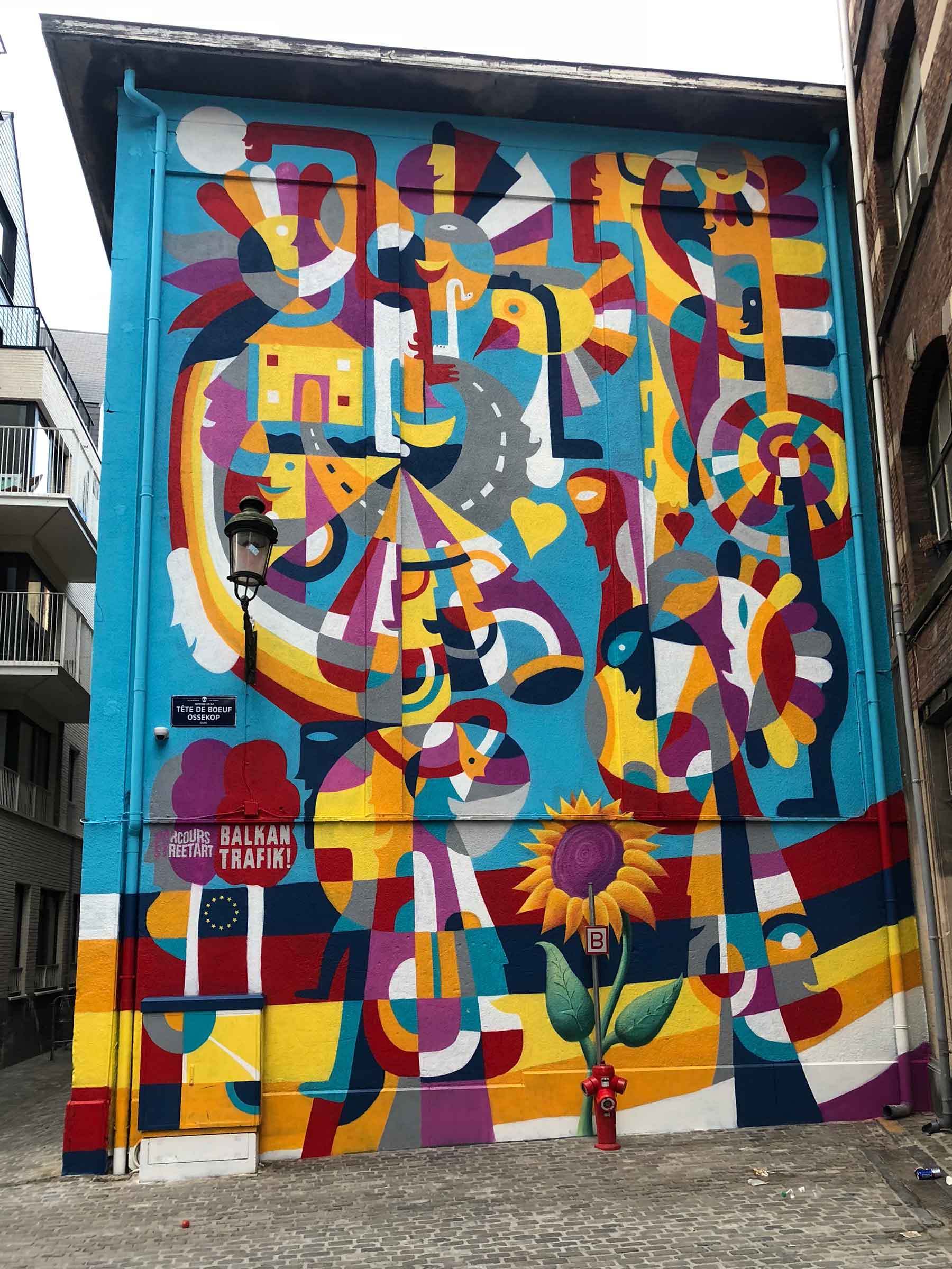
The street art is neither strictly confined to comic book scenes, nor is it produced solely by local artists. In a Belgian-Balkans partnership, the city government is funding works from each of the countries of the Balkans to be splattered across the city. I happened to visit right after the unveiling of the Bosnian entry by Rikardo Druškić, which was inspired by a quote from Saint-Exupéry’s Le Petit Prince, “One can only see well with the heart.”
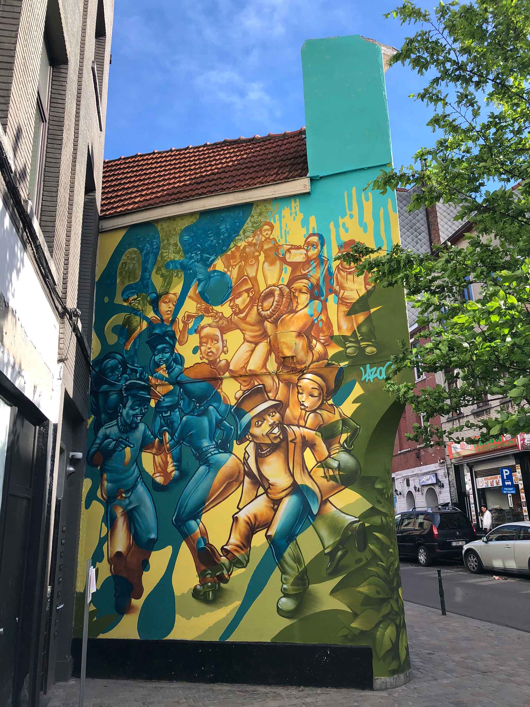
LAZOO is a Parisian street artist who, much like Bansky, has shrouded his identity in mystery over the decades. To commentate the 450th anniversary of the death of Flemish artist Pieter Bruegel, Brussels has commissioned a series of murals inspired by his paintings. Bruegel lived and is buried in the Belgian capital and his paintings are the crown jewel at the Palais des Beaux Arts not far from LAZOO’s mural. Although it may not be obvious at first glance, there is a concerted effort to tie the street art back to Franco-Flemish-Walloon-Belgian culture.
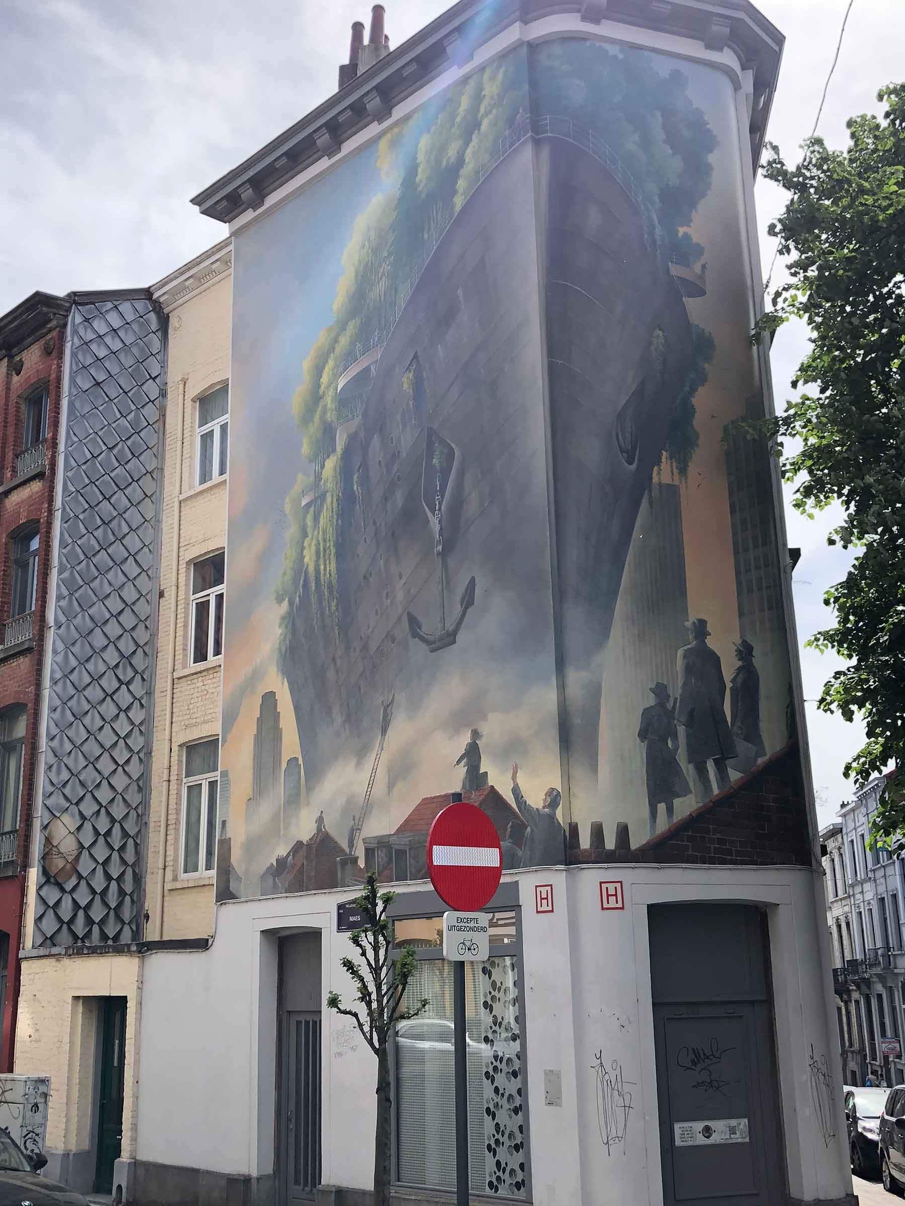
Sometimes the commission of a piece is just as functional as it is aesthetic. The little neighborhood of Ixelles is incredibly charming, with a slightly bohemian vibe and plenty of vegan/vegetarian fare sold along its side streets. The main drag, Chaussée d’Ixelles, had become a little rundown over the years and was in need of face lift. Buildings requiring a fresh coat of paint could sign up for street art instead, and subsequently Ixelles has experienced a resurgence in nightlife and the opening of trendy boutiques. This ship represents the vision of a greener, future city set to take sail from the industrial wasteland below.
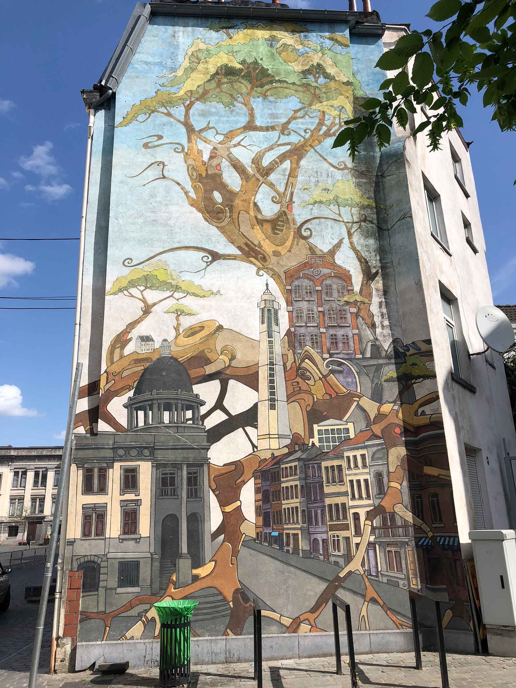
Sometimes the street art simply serves to celebrate a neighborhood, such as this monumental advertisement for Molenbeek’s architectural offerings. (You’ll notice the tower of the Art Deco Église Saint-Jean-Baptiste de Molenbeek that I mentioned in previous post on the right side of the mural!) This street art brings so much character to each neighborhood and it’s nice to witness to what great lengths Brussels has embraced the art form. Growing up in the United States, it’s so hammered into our heads that anything painted on the side of building is “graffiti” and illegal; it’s something to be painted over, cleaned up and erased. In Europe, “graffiti” has been rebranded as “street art” and given value and worth. There is a constant exposure to artistic expression when walking around Brussels that is sadly lacking in many parts of the US.
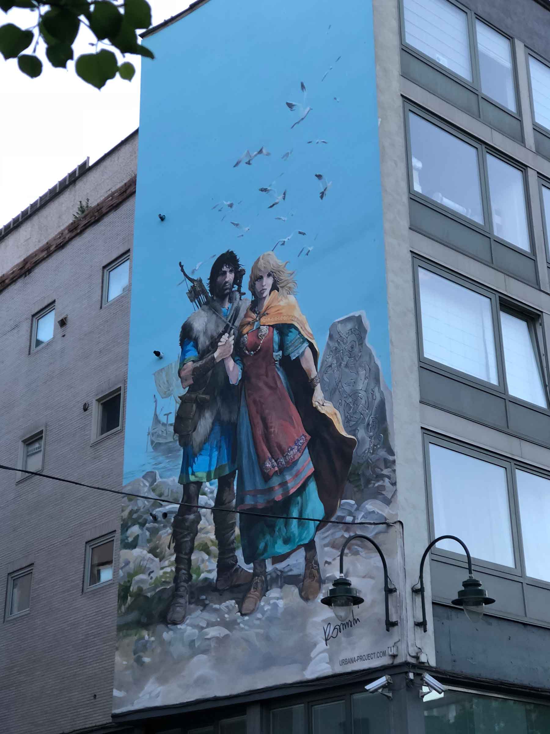
After posting an example from Spirou, I need to balance the scales and give you one of Tintin’s most beloved Belgian comics from author Jean Van Hamme and illustrator Grzegroz Rosiński. The character of Thorgal premiered in 1977 and combines Belgian culture with Norse mythology and the mysteries of Atlantis. His wife Aaricia became an equally popular figure in pop culture and the collection of their comic strips have gone on to sell over 11 million copies. The big deal for this mural, which is sponsored by the urbana-project, a group dedicated to adding artwork to urban landscapes throughout Belgium, was that it was created by original illustrator Rosiński himself.
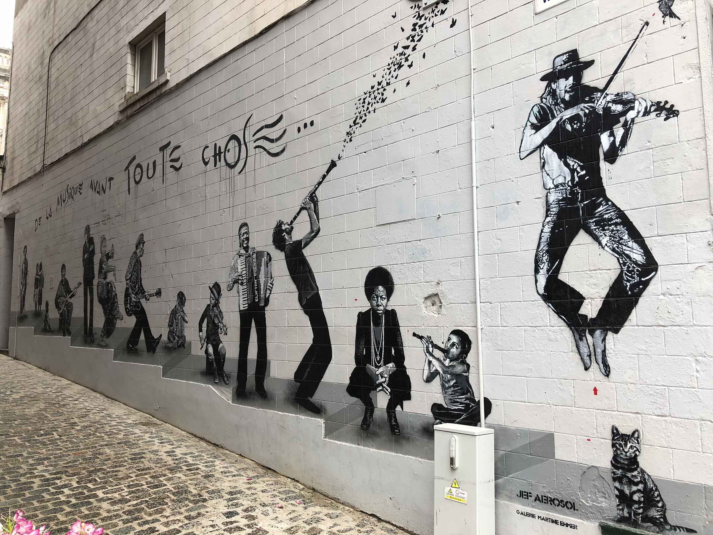
Inspired by a quote from French poet Paul Verlaine, Jef Aérosol created De la musique avant toute chose in the Marolles neighborhood of the capital. Aérosol is also a musician and when he began experimenting with street art in the 1980s, his favorite subjects were famous rockers like Jimi Hendrix, Bob Dylan and The Beatles. Like Bansky, he creates stencils in a studio before translating his images out on the streets. Notice the optical illusion of adding steps to the piece, which genuinely creates depth into the side of the concrete wall. Music transcends all ages, ethnicities, social classes and backgrounds. This parade of people couldn’t be more varied and yet all flow together in a natural progression.
KANAL- Centre Pompidou
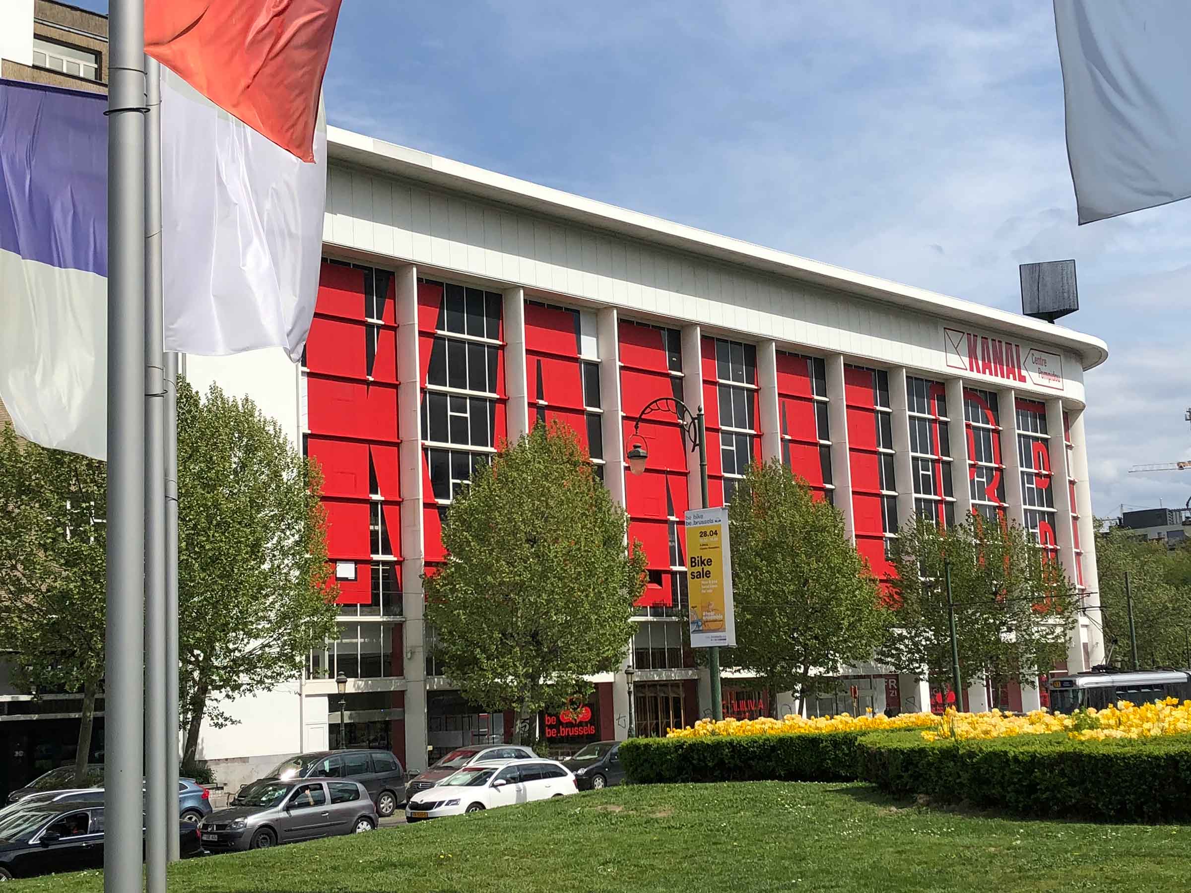
It’s shocking that KANAL only opened its doors in 2018 given that it presented such a cohesive and unified vision that knocked me off my feet and shot the museum into the upper echelon of institutions I have ever visited on my travels. The staff literally had to kick me out, as I spent the entire afternoon wandering through the cavernous building and was the last one out before they shut the lights off!
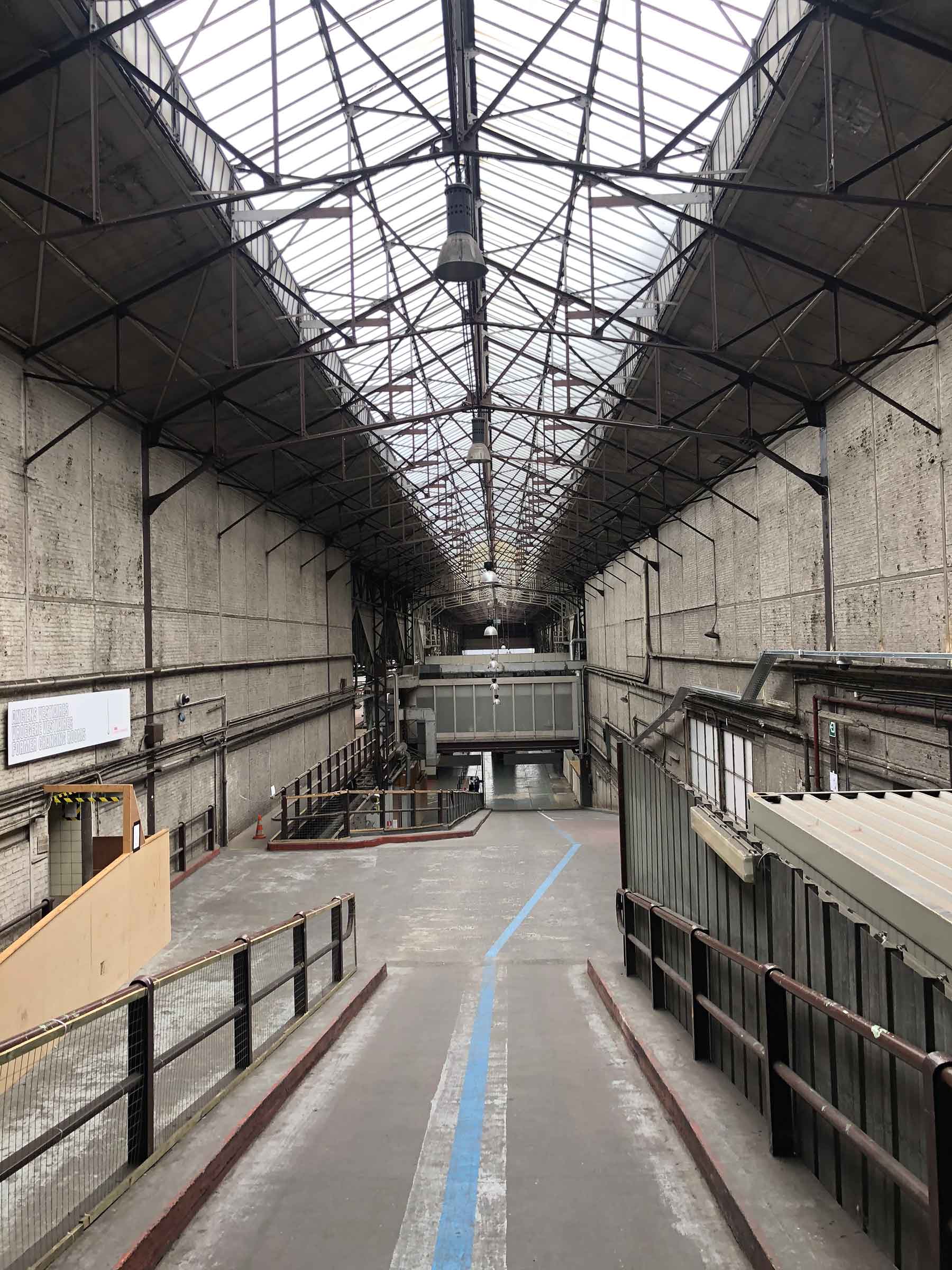
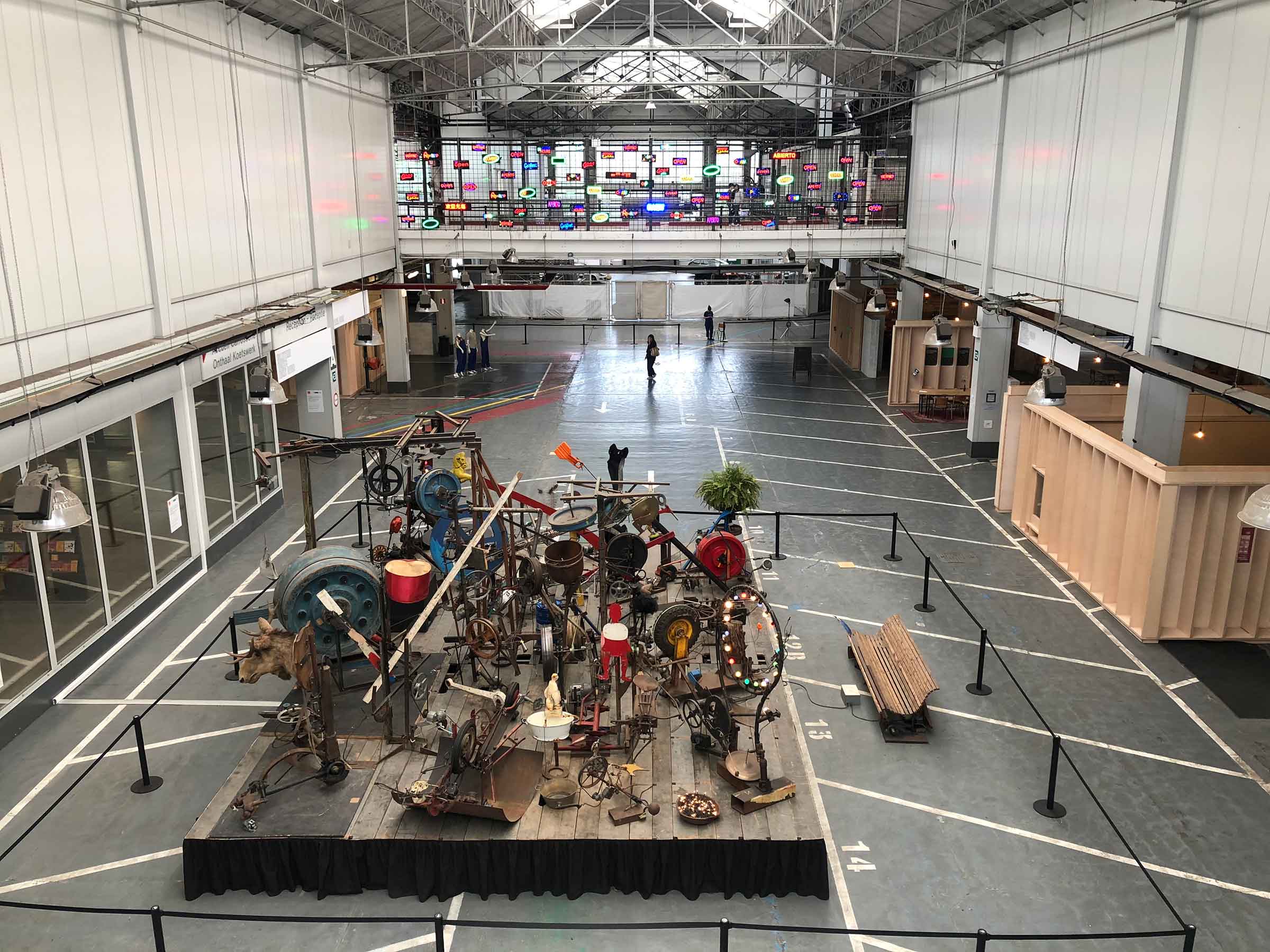
Contemporary art museums seem to be increasingly housed in old factories and warehouses. The industrial ambiance complements the non-traditional art while adding a splash of history into the mix. From the former cork factory in Rīga to the old water filtration plant in Tallinn, repurposing these buildings is all the rage. As much as I enjoyed the other settings, none of them utilized the surroundings quite as effectively as KANAL. This museum, catering specifically to Brussels-based artists, wants its art to intertwine and interact with the space. And at 35,000 square meters (377,000 square feet), there’s a lot of space with which to work. KANAL’s motto is “Perdez-Vous” or “Lose Yourself;” the curators seek to find where the “borders between art and life temporarily merge.” So, allow the different colored-coded paths to be your yellow brick road and discover where the exhibitions will take you.
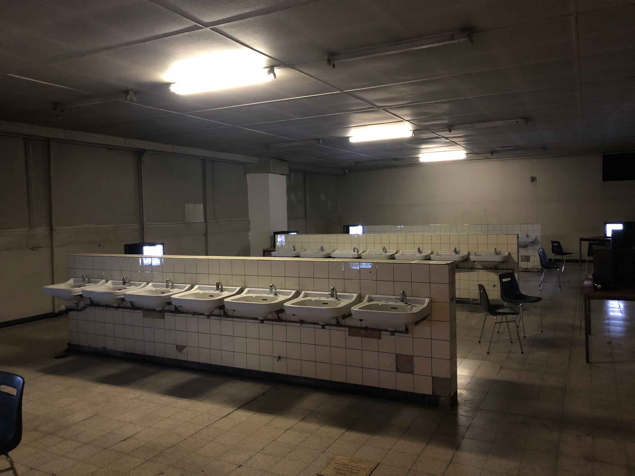
André Citroën purchased this plot of land on which his car factory would be built in the early 1930s, and by the time it was completed, the Brussels Citroën Factory was the largest car manufacturing plant in Europe. There was an immense glass-enclosed showroom in the front; the factory floor and service stations occupied the rear of the building. Citroën was a bit of an engineering pioneer: in 1934, he was the first to mass produce an automobile with four-wheel drive. During WWII, the factory was occupied by the Nazis, but after the war it returned to its original purpose and remained as such through the early 2000s. Eventually Citroën abandoned the facility and the city bought the building in 2015.
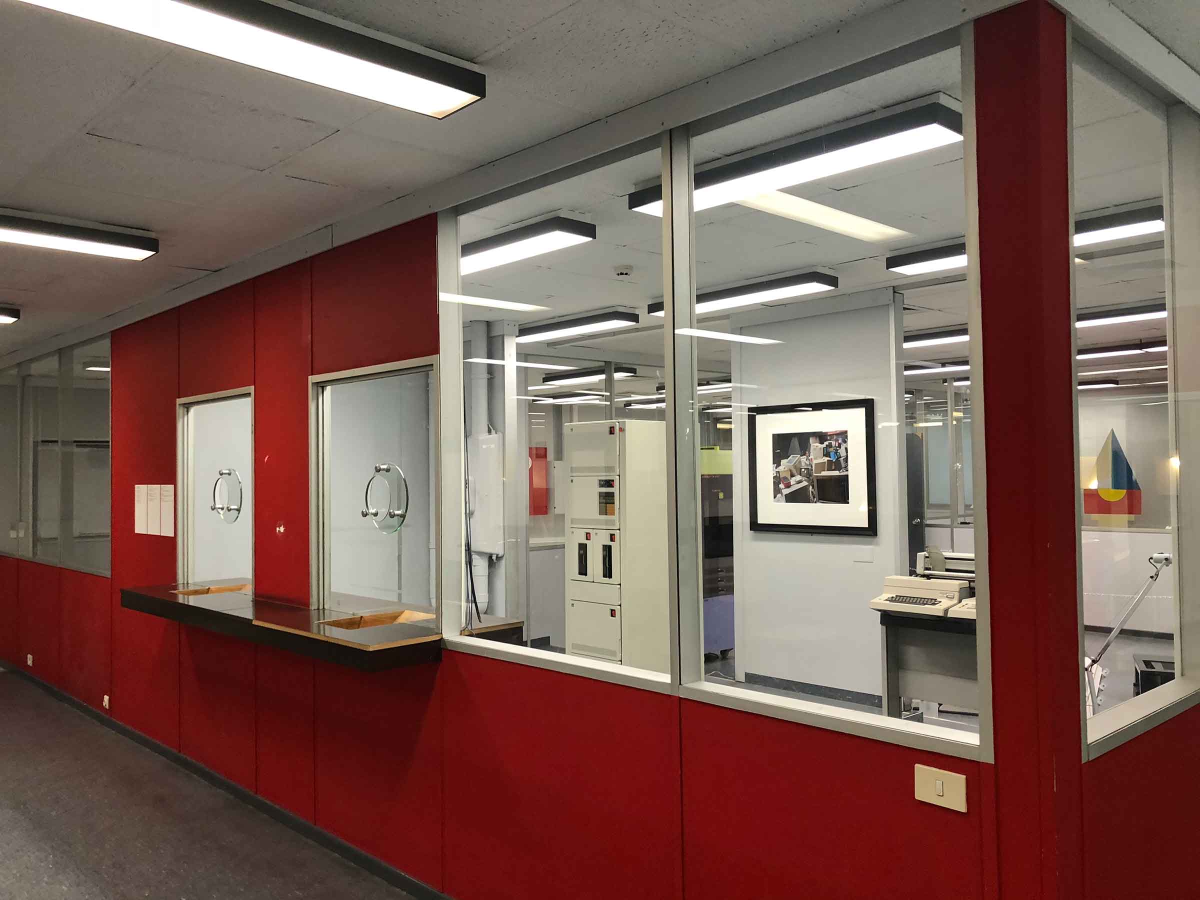
There are five color-coded “roads” you can follow, each with a handful of exhibits to view over three levels of the factory and of which I will now show you a few of my personal favorites. You can explore the pathways in any order; I started with “red,” which led me to the former administration offices of the factory executives. This exhibit was a partnership with ADAM, the Brussels Design Museum. The offices have been recreated exactly as they were in the 1970s, but with a surrealist twist. The curators raided the ADAM inventory, pulling out wild furniture and trippy office decor. The offices are filled with both the ghosts from the past as well as the specters that might have been.
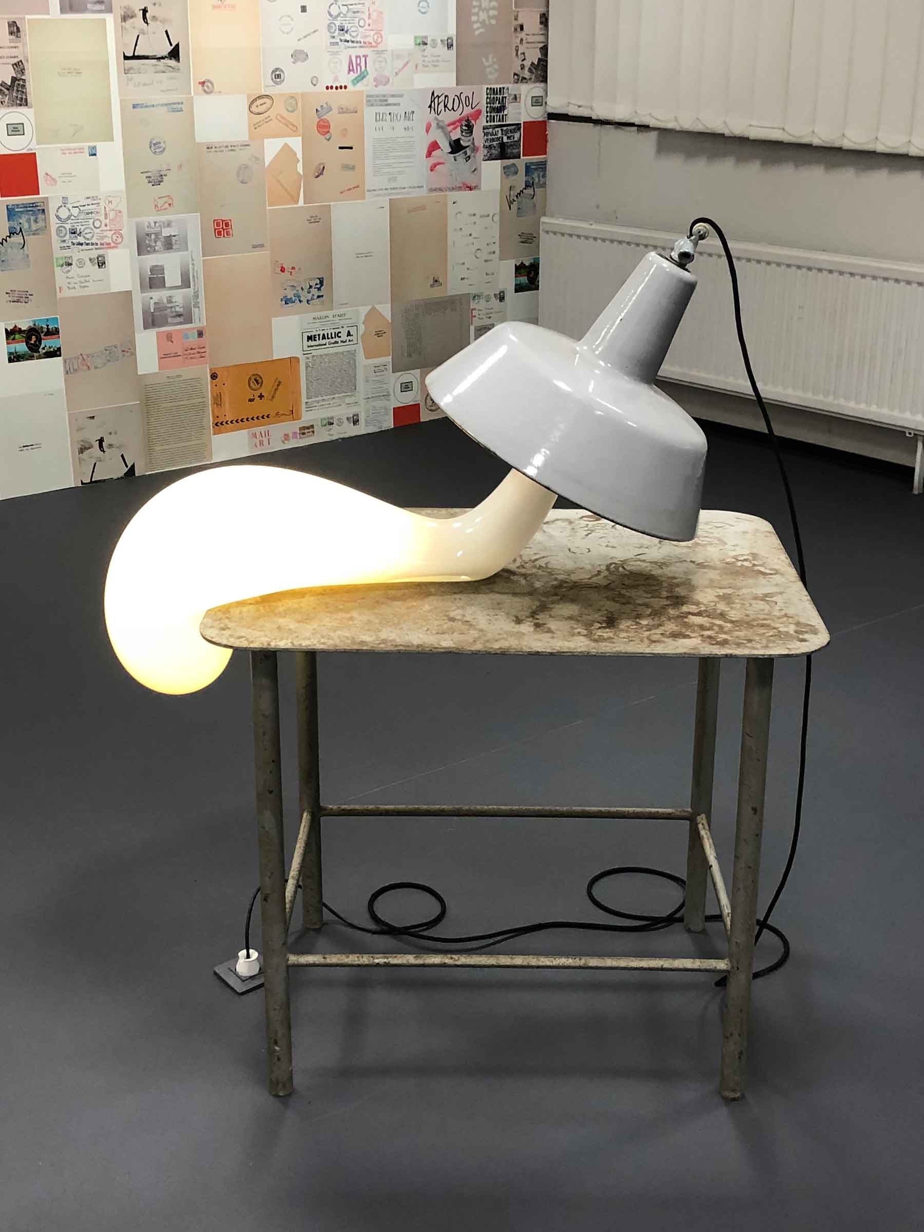
The pieces in Phantom Offices are a critique of functionalism and mock a utilitarian workspace. They resemble reality, and at the same time have little semblance to it. At MIMA, Self’Art was a satire of corporate culture, but here at Phantom Offices, there is an almost nostalgic and dreamlike slant of the same environment. There is humor, but it is graceful rather than cutting. The offices look realistic (because they actually were offices), but at the same time they feel phony and staged.
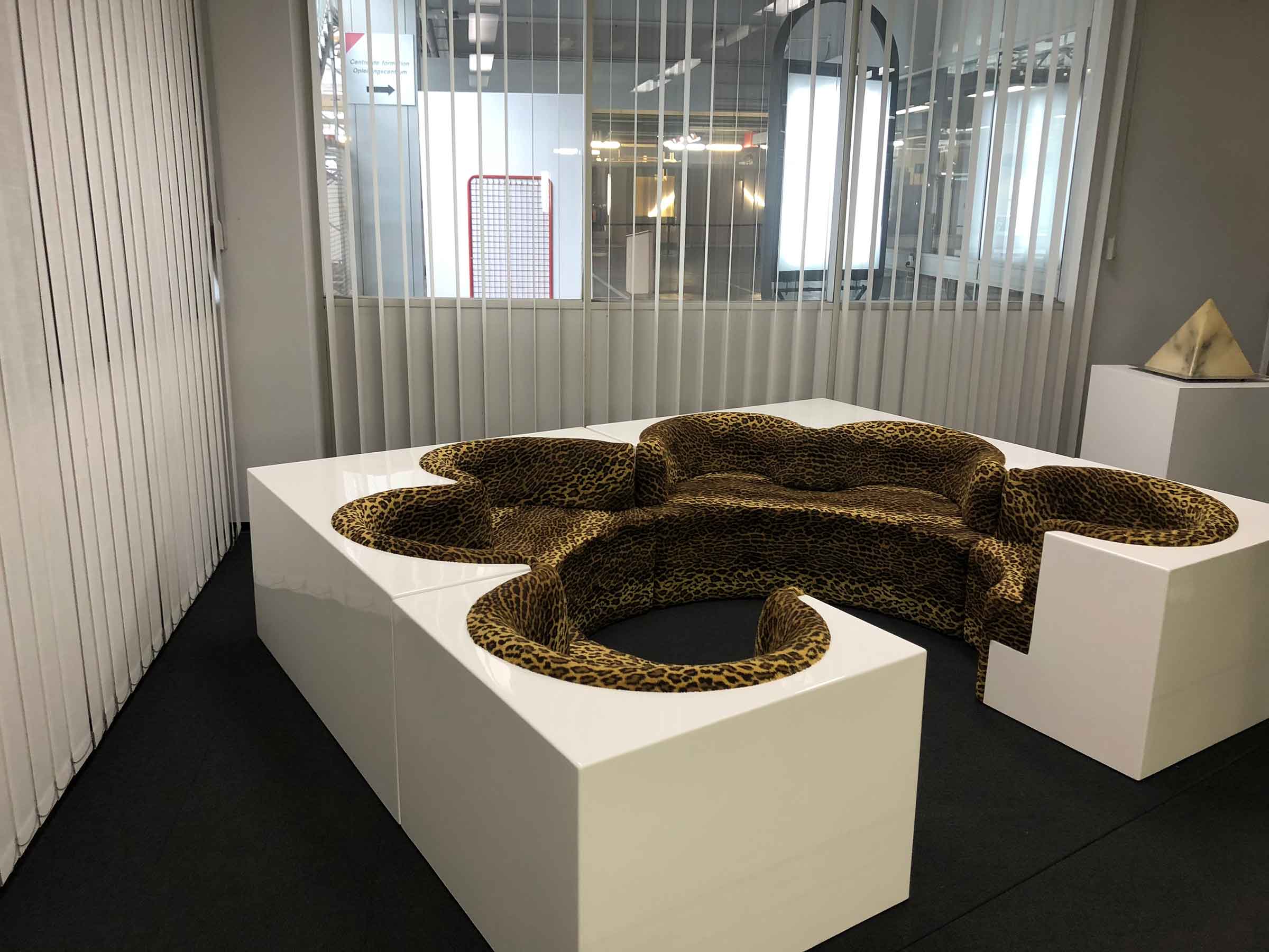
This gaudy four-section sofa at once feels out of place and instantly believable in a corporate setting. Patrick Bateman of American Psycho fame would have both craved and been repulsed by the piece at the same time. Is this sofa proof that you’ve succeed in business without really trying, or have you failed because you tried too hard? Either way, it’s difficult to turn your eyes away.
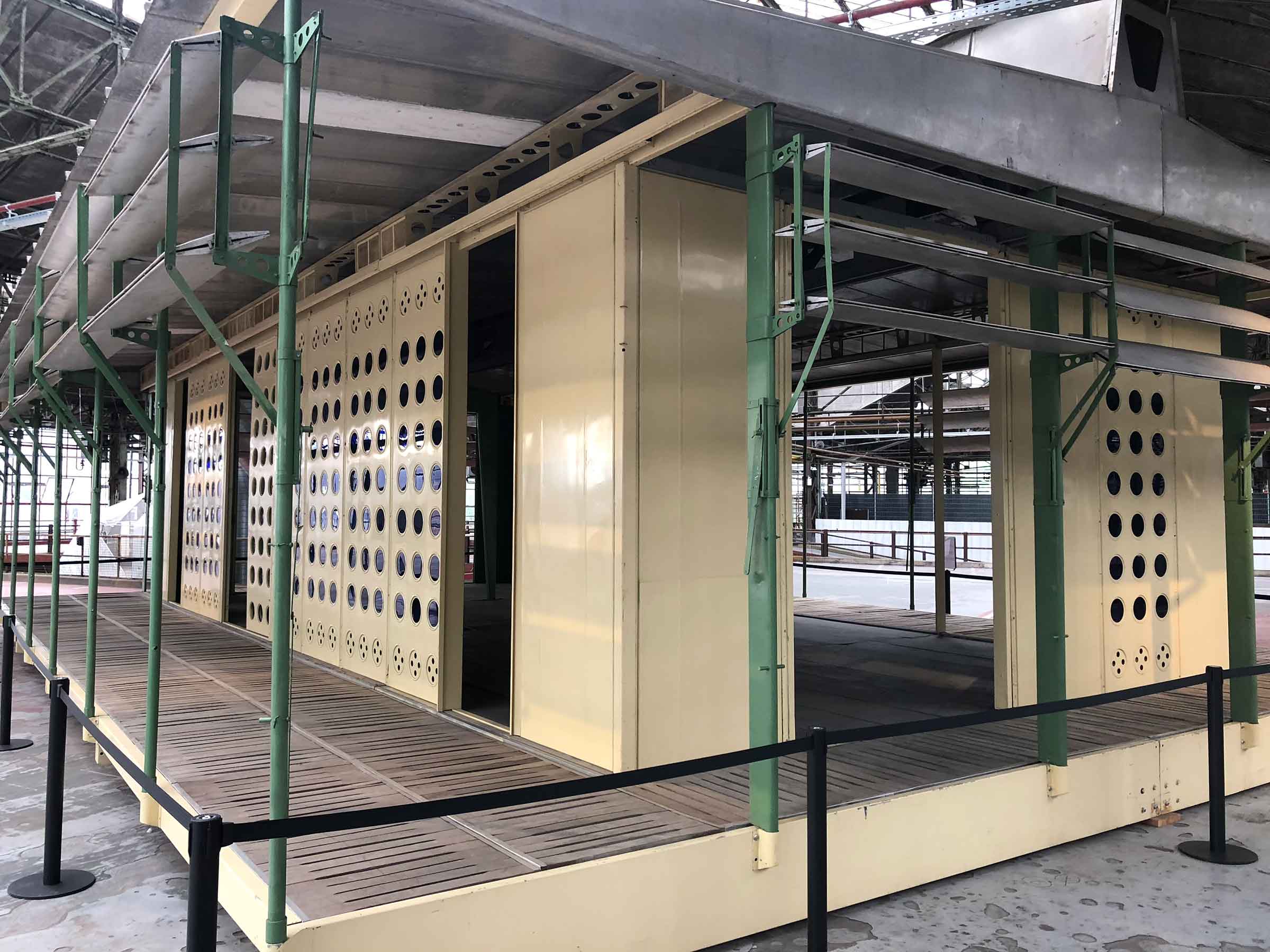
In Post-WWII Central Africa, there was a housing crisis for both native Africans and their European colonists. Jean Prouvé, a French metal worker turned architect, was tasked with designing buildings that would be functional as well as easily mass-produced. This model, created in 1953, was original supposed to populate the Belgian Congo (now the Democratic Republic of the Congo), but only three Tropical Houses ever were constructed (one in Europe, one in Niamey and the last in Brazzaville; all three acted as show homes and were never lived in).
Prouvé used steel, aluminum, tinted glass and wood when designing the Tropical House- all in an effort to combat the hot and humid climate of Central Africa. There was natural ventilation through the raised roof and mobile slats and insulated side panels regulated the temperature during both day and night. Although these houses were designed for both colonists and locals alike, the Belgian government was clear that they wanted the two communities “living together, separately,” leaving the legacy of the ingenuity of the Tropical House in limbo.
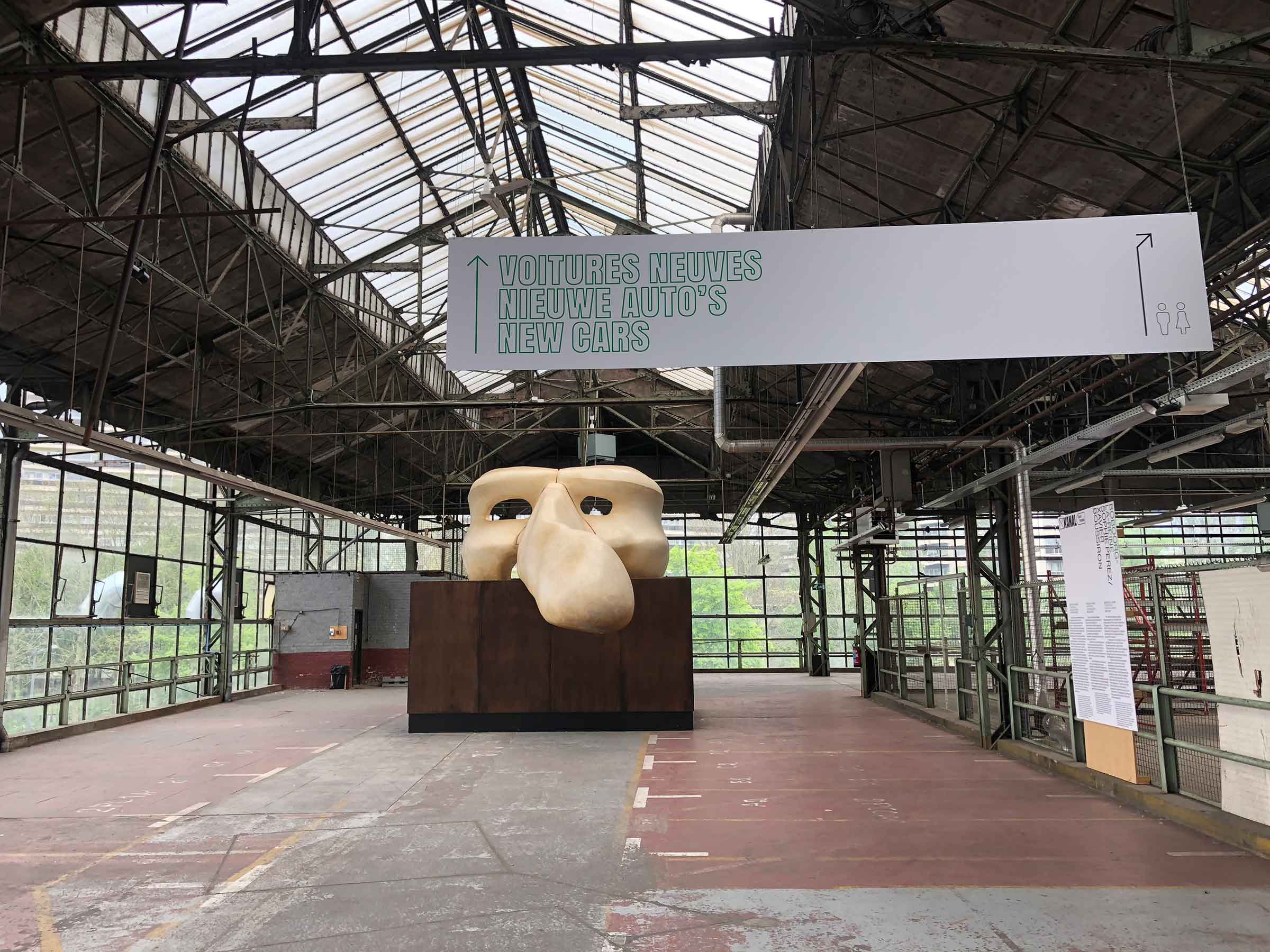
Prouvé’s Tropical House was on the “green” road, that diverged into “Second Hand Cars For Export” like the house, and “New Cars,” like Perez and Boussiron’s Boboorg-la-reine giant Commedia dell’arte mask. The two artists fashioned their oversized mask to appear as if it were made out of fossilized bone, representing the missing Darwinian link in the evolution of the imagination. The Belgian acting troupe, La Compagnie du Zerep, was scheduled to perform in front of the mask over the course of the three weekends.
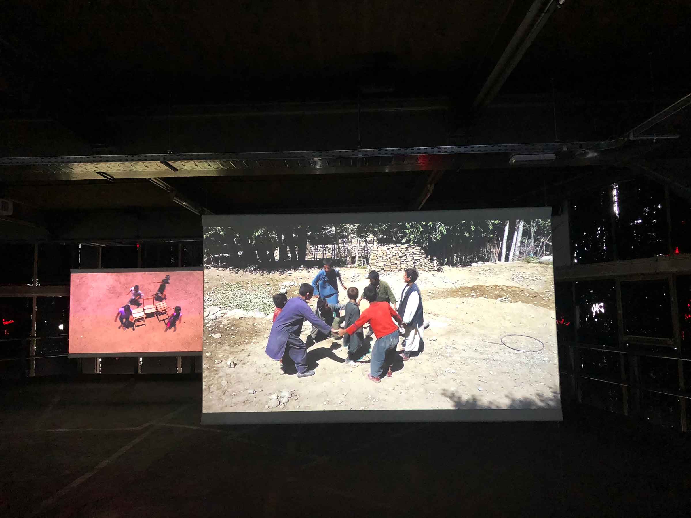
In a darkened upper level of the garage were dozens of screens playing videos of children playing games from all over the world. Francis Alÿs began working on this project in 1999 and completed it in 2016. He filmed kids at play everywhere from wealthy suburbs to war zone refugee camps. He traveled all over the world to such varied places as Venezuela, Afghanistan, France, Morocco, Iraq, Nepal, Jordan, Mexico and, of course, Belgium. He often shot the videos from above in order to expose how the children fully utilized their surroundings and the objects they had at their disposal. With all the angst and critical theory you often encounter with contemporary art, it was rather comforting to watch children across different cultures enjoying each others’ company.
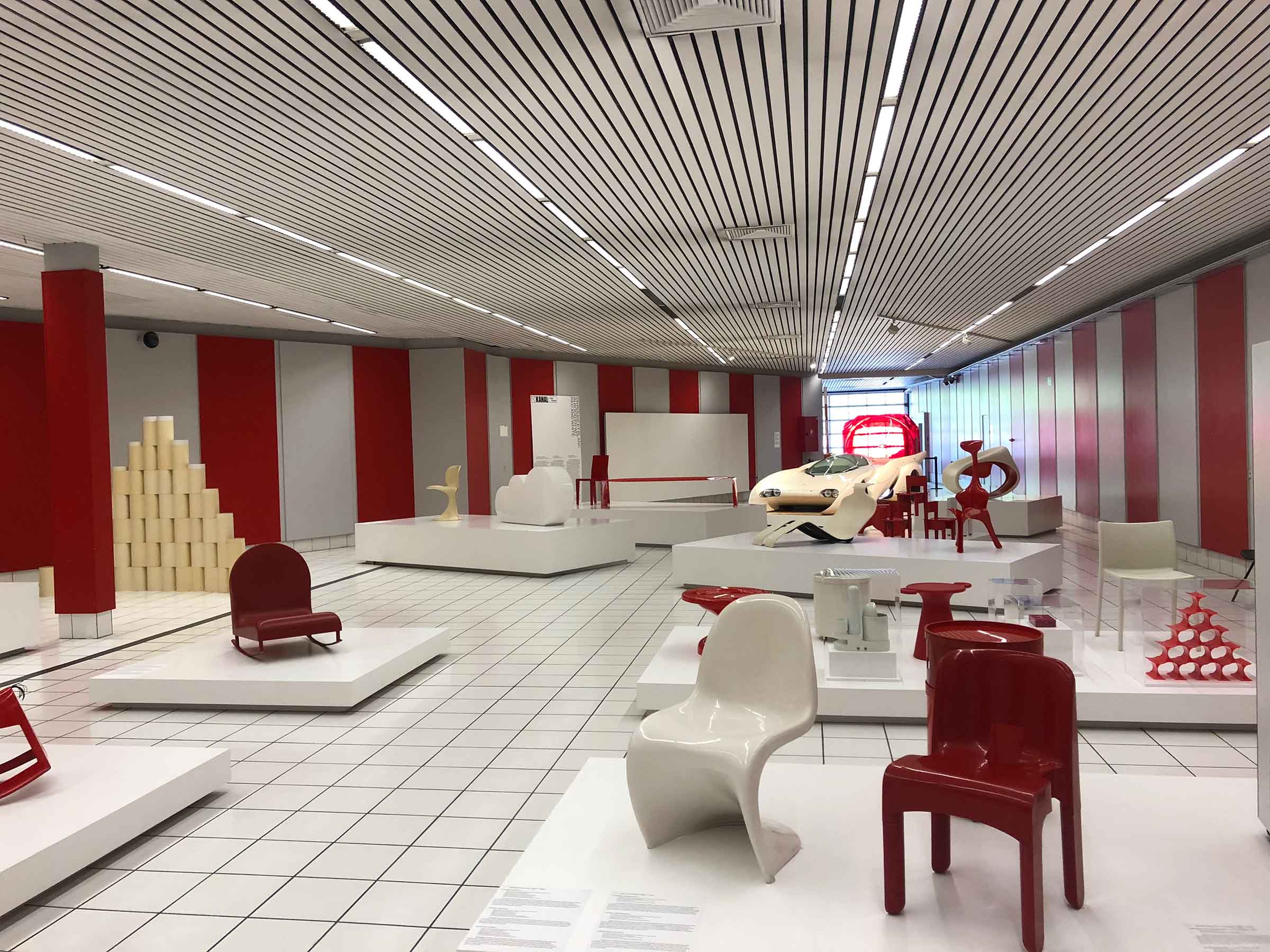
The former vehicle delivery area has been done over in red and white for the exhibition of the same name that is an ode to 1960s pop art design. Plastics and synthetics had taken over the design scene and the red and white combination, which are also the colors of the Citroën logo, represented hedonism and the newfound sexual liberation of the decade.
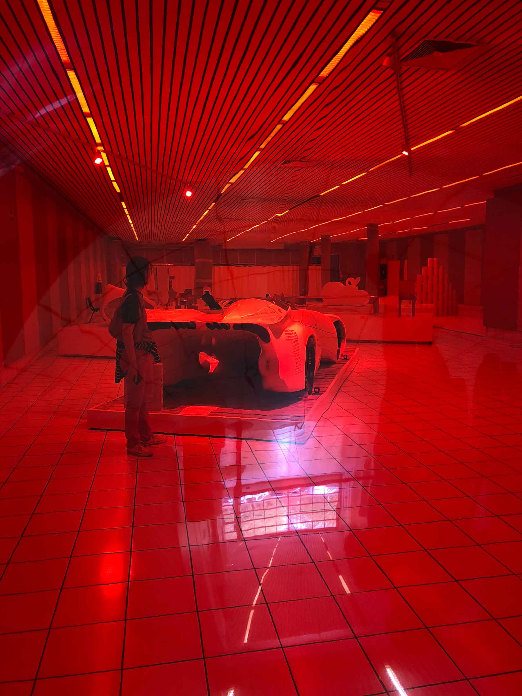
Gérard Fromanger created his Souffle de mai red plastic sculptures for demonstrations in Paris in 1968. Each piece is a giant bubble, that when looked through, tints the world red. The first Souffle de mai was placed near the Moulin Rouge in June of ‘68 and several months later, twelve more were set up around a Paris metro stop. For this second demonstration, Jean-Luc Godard was on hand with a camera to film the installation, which was subsequently interrupted by the police who proceeded to destroy the sculptures and arrest both men. Fromanger’s goal was to ignite a “red revolution” where everyone could participate in the design of collective art.
Ariane Loze just might be my favorite contemporary artist working today. I first came across her videos at an exposition in Latvia and imagine my unbridled joy when I learned she had created a video for the opening of KANAL. In fact, one of the workers, sensing my enthusiasm, told me that Loze lives near the museum and occasionally pops in. If I had met her, I’m sure I would have embarrassed myself by gushing about her genius, so perhaps its better that I admire her work from afar, ha.
Loze is a true one-woman show. Not only does she perform all the roles in her videos, she writes the scripts, acts as camerawoman, director, costume designer, lighting designer and editor. In this 2018 piece, L’Archipel du moi (The Archipelago of Me), Loze recorded her movie inside the Citroën garage, using every inch of the massive space. She often blends the genres of film noir and sci-fiction with witty social commentary and startling performances. (She should seriously make a thriller where she plays a murderous twin of Marion Cotillard. It would be brilliant!)
Don’t let the Belgians’ embrace of street art apps and museum gamification lead you to believe that the contemporary art scene is hiding behind gimmicks and atmospheric settings. These tools allow the art to be more accessible to the greater public and the approach appears to be working. You won’t have to fight the crowds at The Louvre, but numbers are strong and going to the museum and experiencing the street art feels fun. The curators are doing everything they can to break the mold of the stodgy art museum and if my vote counts for anything, they’ve been a smashing success.

